Your kitchen feels dated, but a full remodel is out of reach. You’re staring at the wall and backsplash, knowing they hold the key to a fresh look, but the choices feel paralyzing—what if the colors clash or the style feels wrong in a year? This is the classic dilemma of a kitchen refresh: you want significant visual impact without changing the cabinets, counters, or layout. The good news is that a coordinated kitchen wall color and backsplash refresh is one of the most powerful and cost-effective transformations you can undertake. The challenge, and the art, lies in harmonizing your new selections with the permanent fixtures you’re keeping. This guide cuts through the overwhelm with a practical, constraint-first approach, helping you navigate from that feeling of uncertainty to a cohesive, personalized result that feels both fresh and perfectly at home.
A successful kitchen wall color and backsplash refresh starts by assessing your fixed elements—cabinet finish, countertop material, and lighting—then choosing a wall color to set the mood, and finally selecting a backsplash that harmonizes the two while adding texture and personality. Think of the wall color as your canvas and the backsplash as the strategic bridge that ties everything together, ensuring your update feels intentional, not accidental. This balanced philosophy prevents clashes and creates a look that’s both updated and timeless.
The Unchangeable Constraints: Your Kitchen’s Fixed Elements
Before you fall in love with a paint chip or a stunning tile, you must conduct a ruthless audit of what you cannot—or will not—change. This is the cornerstone of a successful kitchen design refresh. Your fixed elements are the non-negotiables that will dictate the direction of your entire palette.
Your Permanent Palette
Start by identifying these key components:
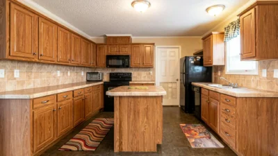
- Cabinet Color & Finish: Are they warm oak, cool gray laminate, or painted white? The undertone (warm, cool, or neutral) of your cabinets is the single most influential factor.
- Countertop Material & Color: Is it beige granite, white quartz, or black soapstone? Note its primary color and any veining or speckling.
- Flooring: Wood, tile, or vinyl? Its color and tone provide the “ground” for your scheme.
- Fixed Lighting & Windows: What is the quality of light? North-facing light is cool and blue, south-facing is warm and yellow. The color temperature of your bulbs (soft white vs. daylight) also dramatically shifts how paint and tile appear.
This assessment isn’t about limitation; it’s about finding your starting point. A kitchen with honey-oak cabinets and beige travertine floors inherently leans warm. One with gray-washed cabinets and stainless steel appliances has a cooler base. Your goal is to choose a wall color and backsplash that harmonize with—not fight against—this existing foundation.

Wall Color First: Setting the Kitchen’s Emotional Tone
With your constraints mapped, the wall color becomes your tool for mood. Think of it as the backdrop against which everything else performs. This kitchen paint color refresh is less about picking a “pretty color” and more about choosing the right emotional filter for your space.
Different color families create distinct atmospheres. Use the following table as a filter to narrow your choices based on your fixed elements and desired feel.
| Color Family | Best For Kitchens With… | Mood Created | Lighting Consideration |
|---|---|---|---|
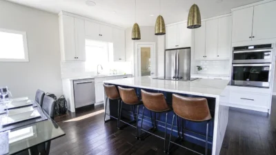
| True & Clean Whites | Dark cabinets, small spaces, or when you want the backsplash to be the star. | Bright, airy, clean, and modern. | Can look stark in low light; choose whites with subtle warmth (like White Dove) for north-facing rooms. |
| Warm Neutrals (Beige, Cream, Greige) | Warm wood cabinets, traditional styles, or spaces that feel too cold. | Cozy, inviting, and grounded. | Enhances warm artificial light; can feel dingy if too yellow in bright south light. |
| Cool Grays & Blues | White, gray, or black cabinets; modern or industrial styles; south-facing rooms. | Crisp, serene, and sophisticated. | Can feel chilly in north light or with cool bulbs; balance with warm-toned wood accents. |
| Bold & Deep Accents | Large, well-lit kitchens with simple cabinets; used on an accent wall or in a pantry. | Dramatic, intimate, and personality-rich. | Dark colors absorb light; ensure you have ample task lighting at counter level. |
For sheen, eggshell is the standard for kitchen walls as it’s durable and wipeable with just a hint of sheen. Avoid flat/matte finishes in high-splash zones.
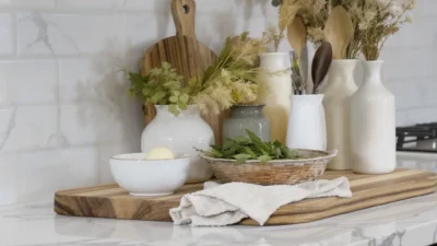
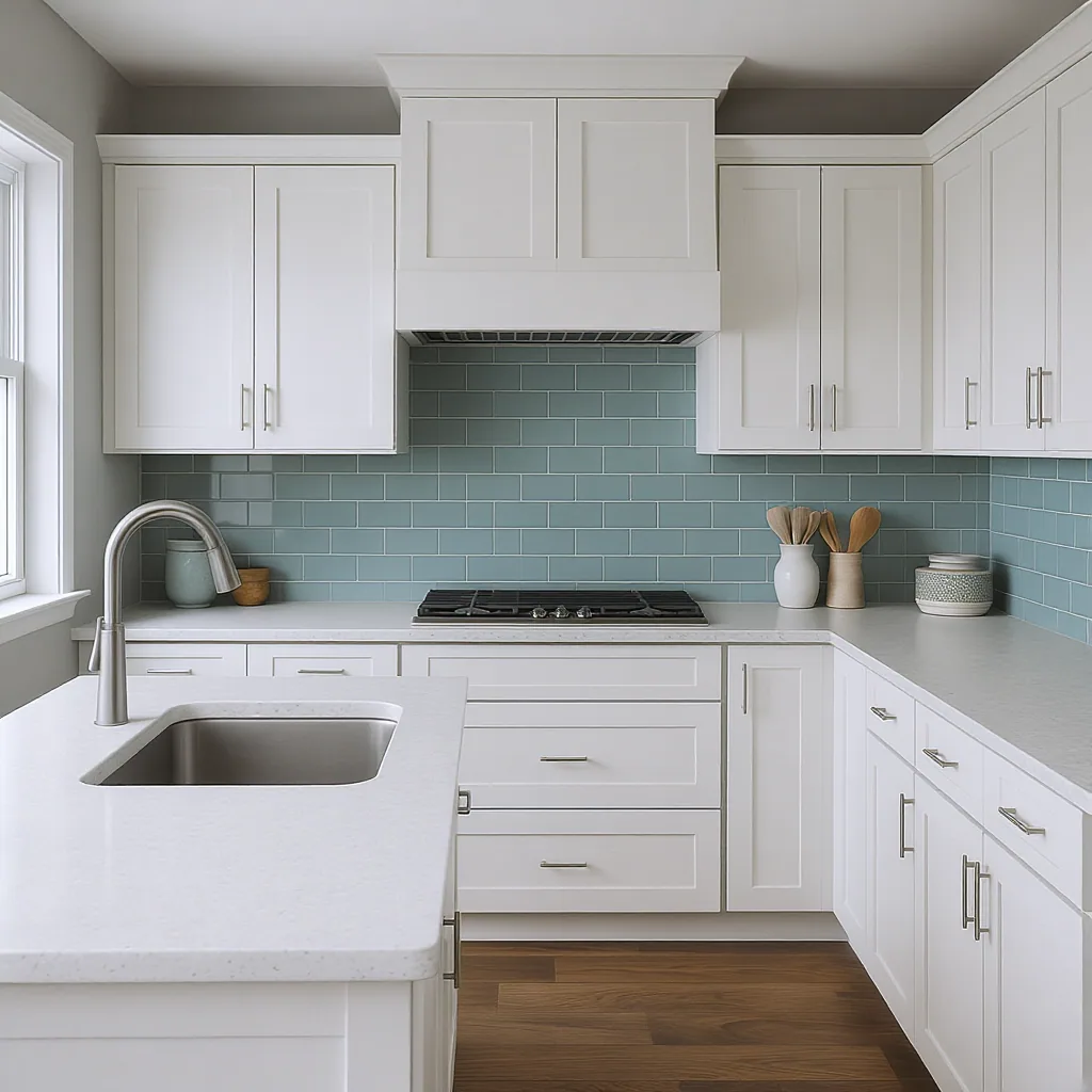
The Backsplash as Bridge and Focal Point
Now for the star player: the backsplash. Its job is dual-purpose. First, it must act as a visual bridge, seamlessly connecting your wall color to your countertops and cabinets. Second, it serves as a primary backsplash decor update, injecting texture, pattern, and personality. Choosing the right material and scale is key.
Material Matters: Durability Meets Style
Your backsplash needs to withstand heat, steam, and splatters. Here’s a quick comparison of popular backsplash material options:
- Ceramic & Porcelain Tile: The workhorses. Durable, affordable, and available in endless colors and finishes (glossy, matte, handmade). Porcelain is denser and less porous, making it ideal for behind the stove.
- Glass Tile: Reflects light beautifully, making spaces feel larger. Available in sheets of mosaic or subway tiles. It’s non-porous and easy to clean, though the grout lines still require maintenance.
- Natural Stone (Marble, Slate, Travertine): Offers unique, organic veining and texture. Requires sealing to prevent stains. It’s a commitment but adds undeniable luxury.
- Metal (Stainless, Copper): Ultra-modern and incredibly easy to wipe down. Can show fingerprints and water spots, so it suits a sleek, utilitarian aesthetic.
Playing with Scale
The size and pattern of your tile dramatically affect the room’s feel. Large-format tiles (like 4”x12” or 6”x24”) create clean, serene lines with minimal grout. Classic 3”x6” subway tile offers timeless appeal. Mosaic sheets (small tiles in a mesh-backed sheet) are perfect for adding intricate detail and color in a controlled way—ideal for a backsplash renovation that wants to make a statement without overwhelming.
Coordinating the Pair: Color, Value, and Texture Rules
This is where your kitchen color scheme update comes together. The relationship between your wall and backsplash should feel intentional, not accidental. Follow these practical guidelines for a harmonious result.
Do: Use the 60-30-10 Rule as a Guideline
In this classic design principle, your wall color is the dominant 60%, your cabinets (and maybe flooring) are the secondary 30%, and your backsplash acts as part of the accent 10%. This helps create balance. A neutral wall (60%) lets a vibrant, patterned backsplash (10%) sing without chaos.
Do: Mind the Value Contrast
Value means lightness or darkness. For clear definition, ensure there’s contrast in value between your countertop and backsplash, or between your backsplash and wall. If you have a dark countertop, a light backsplash will pop. If your wall and cabinets are light, a mid-tone or dark backsplash adds grounding.
Don’t: Ignore Undertones
This is the most common pitfall in wall and backsplash coordination. A gray paint with a blue undertone will clash with a backsplash tile that has a green or pink undertone. Always compare samples together in your kitchen’s light. Hold paint chips against tile samples and your countertop.
Do: Let Texture Do the Work
If you love a monochromatic scheme (e.g., all shades of white), introduce visual interest through texture instead of color. Pair a smooth, satin-paint wall with a handmade zellige tile that has variation and shine, or a matte subway tile with a lightly textured plaster wall.
Common Refresh Mistakes and How to Sidestep Them
Even with the best plans, small oversights can derail a project. Here are the most frequent missteps in a DIY kitchen makeover color choices project and how to avoid them.
Mistake 1: Picking colors in the store. Fluorescent lighting completely distorts color. Solution: Always get physical samples. Paint a large poster board and tape tile samples to the wall. Live with them for a few days, observing them in morning, noon, and evening light.
Mistake 2: Forgetting the grout. Grout color is part of your backsplash’s final appearance. A dark grout with white subway tile creates a graphic, modern grid; a matching grout creates a seamless, subtle look. Solution: Test grout samples with your tile before you buy.
Mistake 3: Chasing a fleeting trend. That ultra-specific color of the year might feel dated quickly. Solution: Use trendy colors in smaller, changeable doses (accessories, a single wall) and invest in timeless materials for permanent surfaces like backsplash tile.
Mistake 4: Underestimating sheen. A high-gloss backsplash in a small kitchen can feel busy and show every imperfection. Solution: In most kitchens, a matte, satin, or honed finish is more forgiving and feels more contemporary.
Mistake 5: Not considering the whole sightline. You see your kitchen from the adjoining room. Solution: Step back into your living area or hallway to ensure your new wall color and backsplash work harmoniously with the rest of your home’s flow.
Your Refreshed Kitchen Awaits
A successful kitchen update isn’t about choosing the most beautiful tile or the trendiest paint in isolation. It’s a thoughtful exercise in coordination, where you work with what you have to create what you want. By starting with your fixed constraints, using wall color to set the mood, and selecting a backsplash that bridges everything together, you make intentional choices that result in a cohesive, personal space.
The most powerful tool at your disposal isn’t a color wheel—it’s a sample. Testing materials in your actual space under real lighting conditions is the single best way to prevent regret and build confidence. Trust the process, embrace the constraints, and enjoy the transformation of your kitchen’s heart and soul.
To execute a coordinated kitchen wall and backsplash refresh, follow this core sequence:
- Audit Fixed Elements: Objectively assess your cabinet finish, countertop, flooring, and lighting. Their undertones and style dictate your palette’s direction.
- Choose Wall Color for Mood: Select a paint color that creates your desired atmosphere (airy, cozy, crisp, dramatic) while harmonizing with your fixed elements. Always test samples on site.
- Select the Backsplash as a Bridge: Pick a tile material and pattern that visually connects your wall color to your countertops and cabinets. Use it to add texture, pattern, or a controlled pop of accent color.
- Coordinate with Intent: Apply practical rules: ensure value contrast, beware of clashing undertones, and let texture add interest if using a monochromatic scheme. Never forget to choose your grout color thoughtfully.