You’re standing in the paint aisle, surrounded by a sea of color swatches, feeling that familiar wave of decision fatigue. Your beautiful new oak cabinets are installed, but now the question looms: what colors do you pair with them? The sheer number of choices can be paralyzing. But here’s the secret that simplifies everything: your cabinet tone isn’t a limitation—it’s your most powerful tool. The best way to choose a kitchen color palette is to let the inherent warmth, coolness, or neutrality of your cabinets guide you. This approach transforms an overwhelming task into a clear, two-path decision: do you want to create a harmonious, flowing space that works *with* your cabinets, or a dynamic, energized room that creates deliberate contrast *against* them? By starting with your cabinets, you anchor the entire design, making every subsequent choice—from wall color to backsplash—feel intentional and cohesive.
Here’s how to choose a kitchen color palette by cabinet tone: start by identifying your cabinet’s undertone (warm, cool, or neutral). Then, decide on your core design approach—either harmonize with that tone for a cohesive look or create deliberate contrast for dynamic energy. Your cabinet color becomes the anchor from which you select wall colors, backsplash, countertops, and accents.
Start Here: Decoding Your Cabinet’s Undertone
Before you pick a single paint chip, you need to diagnose your cabinet’s dominant color personality. This isn’t about the obvious stain or paint color, but the subtle undertone hiding beneath it. Getting this right is the foundation of all your kitchen palette planning. Think of it as identifying your cabinet’s “temperature”—is it warm, cool, or neutral?
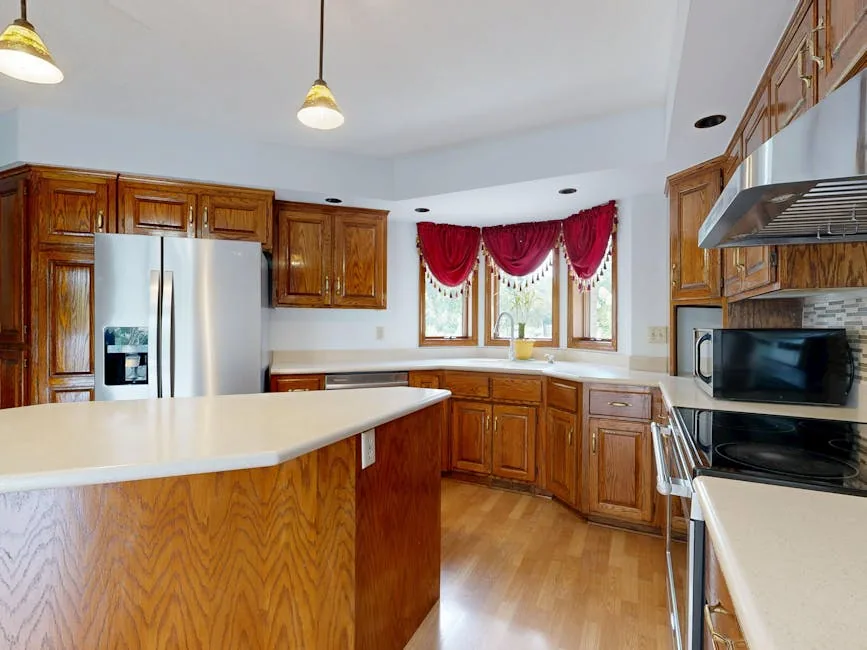
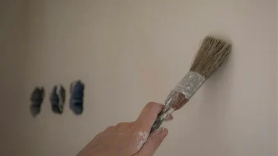
Photo by Peter Vang on Pexels
How to Find the Undertone
You don’t need a design degree. Try these simple tests in natural daylight:
- The White Paper Test: Hold a pure white sheet of paper next to your cabinet. Does the cabinet look yellowish, reddish, or creamy next to it? That’s warm. Does it appear bluish, grayish, or steely? That’s cool. If it just looks like a clean, true version of its color with no obvious cast, it’s likely neutral.
- The Comparison Test: If you have a known warm wood (like classic oak) or a cool gray tile elsewhere, compare. Your cabinet will visually “group” with one.
- Common Examples: Most natural wood cabinets (oak, cherry, maple with honey stains) have warm, yellow/red undertones. Painted cabinets in shades like charcoal, slate blue, or crisp white with a gray base are cool. True black, pure white, or some beiges can be neutral, but always double-check—many “whites” lean warm or cool.
This step of cabinet tone color coordination turns guesswork into a clear starting point. Once you’ve locked in the undertone, you’re ready to choose your design path.
Path One: The Harmonious Palette (Working With Your Cabinets)
This is the path of least resistance and maximum serenity. Choosing a harmonious palette means selecting colors that live in the same undertone family as your cabinets. The result is a cohesive, flowing space that feels intentionally designed and often more spacious. This approach is especially forgiving and is a fantastic best way to choose a kitchen color palette for first-timers.
Let’s break it down by cabinet type:
For Warm-Toned Cabinets (e.g., Oak, Cherry, Honey Maple)
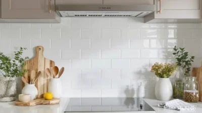
Embrace the cozy vibe. Pair these cabinets with other warm, earthy hues. Think creamy whites (avoid stark, cool whites), soft beiges, warm grays (greige), olive green, or muted terracotta. A kitchen color palette with wood cabinets like these might feature cream-colored walls, a beige-and-cream marble-look quartz countertop, and a backsplash in a warm, sandy travertine.
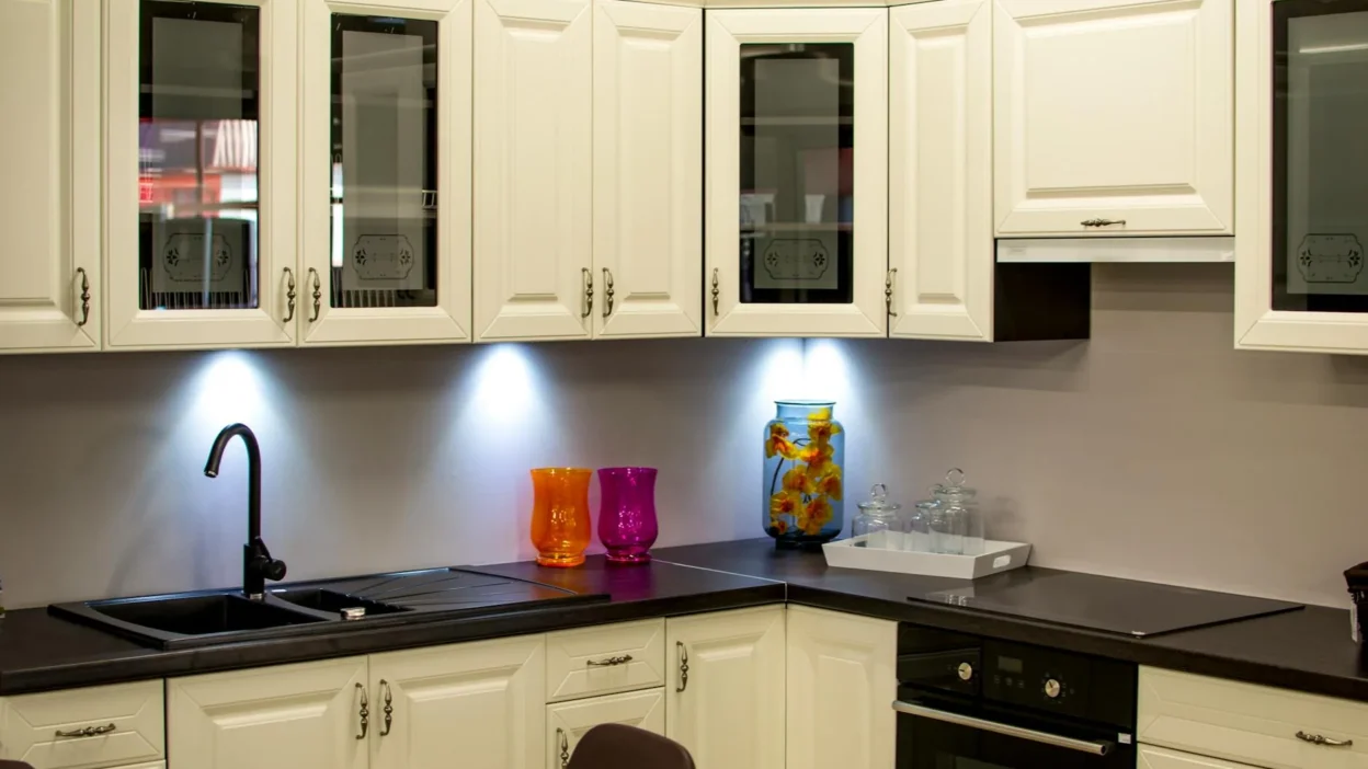
For Cool-Toned Cabinets (e.g., Gray, Blue, Black, Cool White)
Amplify the crisp, calm atmosphere. Look to other cool colors: pure whites, light grays, soft sage greens, pale blues, or even deep navy. Walls in a light gray or sage green will make cool white shaker cabinets feel fresh and airy. A slate blue cabinet paired with a pale gray wall and white marble countertops creates a sophisticated, unified look.
For Neutral Cabinets
You have the most flexibility! True neutrals act as a blank canvas. You can gently lean into either warm or cool accents without clashing. Just ensure your other elements (walls, counters) agree on a direction. A neutral cabinet lets you change your accent wall color seasonally without a full remodel.
Path Two: The Contrasting Palette (Creating Visual Energy)
If harmonious is a calm river, contrasting is a sparkling waterfall. This path is about deliberate, exciting opposition. It’s a powerful design choice that makes your cabinets and walls truly sing by putting them in a vibrant dialogue. The key is intentional contrast, not accidental clash.
Principles of Powerful Contrast
You can create contrast in a few ways:
- Warm vs. Cool: This is the most dynamic. Pair warm oak cabinets with walls in a cool, deep navy or a soft gray-blue. The warmth of the wood pops brilliantly against the cool backdrop.
- Light vs. Dark: Use your wall color to frame your cabinets. Dark espresso cabinets shine against light, airy walls (like a pale linen color). Conversely, bright white cabinets become stunningly graphic against a deep, moody wall color like charcoal or forest green.
- Complementary Colors: On the color wheel, colors opposite each other create high contrast. For example, a cabinet with a subtle red undertone (in some mahoganies) can be contrasted with a very soft, grayed-out green.
The goal isn’t chaos but balanced energy. When matching colors to kitchen cabinets for contrast, let one element be the star (usually the cabinets) and use the contrast to frame it. Always test large samples, as contrast can be intense in a full room.
Building Your Full Palette: From Walls to Finishing Touches
Your cabinet-wall relationship is the anchor, but a complete kitchen palette planning job involves the supporting cast. Use the classic 60-30-10 design rule as a guide: your cabinet color is typically the dominant 60%, your wall and countertop colors form the secondary 30%, and backsplash, hardware, and accessories make up the final 10% for accent.
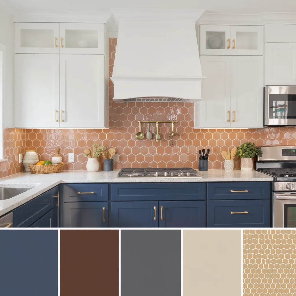
Countertops & Backsplash: The Connectors
Your countertop should work with both your cabinets and walls. If you’ve chosen a contrasting path, a neutral countertop (like white quartz, concrete gray, or black granite) can be a peaceful mediator. For a harmonious scheme, you can be more adventurous with veining or color that echoes the palette.
The backsplash is your prime opportunity to tie everything together. It can pick up a secondary color from your countertop veining, or introduce a subtle pattern that includes both your cabinet and wall hues. For a safe bet, a simple subway tile in a neutral always works.
Flooring, Hardware & Accents
Flooring should generally be neutral or lean toward the undertone of your largest element (usually the cabinets). Hardware is part of the 10% accent—this is where you can add a metallic pop (brass, black matte, nickel). Finally, bring in your accent color through textiles, small appliances, or a bowl of fruit. This is the easiest part to change if you want to refresh your look later.
Your Cabinet, Your Canvas
Staring at those paint swatches doesn’t have to be overwhelming. Your cabinet tone isn’t a restriction; it’s the most valuable clue you have. By first identifying its undertone and then consciously choosing to either harmonize or contrast with it, you’ve done the heavy lifting of designing a kitchen color palette. The rest is simply building out the layers with countertops, backsplash, and your personal accents.
So, take a breath. Pick your path—cohesive calm or dynamic contrast. Grab some large sample pots, paint big swatches on your walls, and live with them for a day. See how the light changes them. Your perfect, personal kitchen is waiting just on the other side of that decision.
Q: Can I mix warm and cool tones in my kitchen?
A: Absolutely! This is the essence of the “contrasting” path and can create stunning, dynamic spaces. The key is to be deliberate and ensure one tone dominates to avoid a confusing, 50/50 split. For example, warm wood cabinets (dominant) with cool blue-gray walls (accent) is a classic and effective mix.
Q: What if my cabinets have multiple tones (like a wood grain)?
A: Focus on the overall, dominant tone you perceive from a few feet away. That’s the undertone you should coordinate with. You can then pull a secondary, less prominent color from the grain for a subtle accent elsewhere, like in a rug or decorative piece, to create a nuanced, layered look.
Q: Are white cabinets always a neutral starting point?
A: Not always. White paints have undertones too. Some whites are crisp and cool (blue/gray base), others are creamy and warm (yellow/red base). Always test your white cabinet against pure white paper and your other materials. A “neutral” white is one that doesn’t strongly lean warm or cool against your specific lighting and countertops.
Q: How many colors should be in my final kitchen palette?
A: For a cohesive look, limit your main palette to 3-5 colors. This typically includes: 1) Cabinet color, 2) Wall color, 3) Countertop color, 4) Backsplash color, and 5) an Accent color for hardware and decor. Using the 60-30-10 rule helps keep this balance in check and prevents the space from feeling too busy or disjointed.