Choosing a color for your kitchen refresh often comes with the well-meaning but ultimately unhelpful advice to “just pick what you love.” While personal preference is king, treating warm vs cool kitchen colors as a purely emotional choice misses their strategic power. This isn’t just about hue; it’s about color temperature and undertones, which are the secret tools that can make a north-facing room feel sun-drenched, a cramped galley appear airy, or a sterile space instantly cozy. By understanding the fundamental conflict—warm tones invite and energize, while cool tones calm and expand—you can move beyond guesswork. Let’s build a personalized framework to decide which palette will not only look beautiful but actually improve how your kitchen feels and functions every day.
Here’s how to decide between warm and cool colors for your kitchen refresh: start by assessing your kitchen’s natural light and size. Warm colors (creams, terracotta, warm grays) add coziness and work well in north-facing or large, sterile spaces. Cool colors (blues, greens, crisp whites) create a sense of airy calm and are ideal for south-facing, small, or hot kitchens. Your existing finishes and desired mood are the final deciding factors.
The Feel Factor: What Warm and Cool Colors Actually Do
Think of color temperature as the emotional thermostat for your kitchen. It’s not just about picking a pretty shade; it’s about choosing the feeling you want the room to have every day. This all comes down to undertones—the subtle hints of color within a paint or finish.
Warm colors have undertones of red, yellow, or orange. Imagine a creamy off-white, a soft terracotta, a buttery yellow, or a warm gray with a hint of brown. These hues are inherently inviting. They advance visually, making walls feel closer and spaces feel more intimate and cozy. They stimulate conversation and appetite, which is why they’re a classic choice for gathering spaces. In terms of kitchen color psychology, warmth creates energy and comfort.
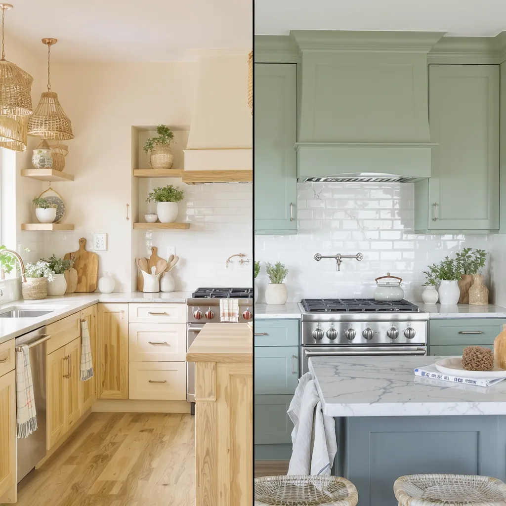
Cool colors have undertones of blue, green, or violet. Picture a crisp, pure white, a serene sage green, a slate blue, or a cool gray with hints of blue. These colors recede, making walls feel farther away and rooms feel more spacious and airy. They evoke calm, cleanliness, and order—perfect for a space where precision and function are key. A cool palette can make a kitchen feel like a tranquil, efficient haven.
Remember, even neutrals have a temperature. A “white” can be warm (ivory) or cool (icy). A “gray” can be warm (greige) or cool (slate). Always check the undertone on the paint chip in your own light.
Your Kitchen’s Reality Check: The 3 Key Decision Points
You can’t choose the best kitchen colors for a refresh in a vacuum. The right answer lies at the intersection of your kitchen’s fixed attributes and your goals. Use these three filters to guide your choice between warm and cool kitchen color undertones.
1. Natural Light & Window Direction
This is your most important factor. Light dramatically changes how paint color appears.
North-facing or low-light kitchens receive cool, bluish light that can feel stark. Here, warm kitchen paint colors (creams, warm whites, soft yellows) act as a corrective, injecting needed warmth and counteracting the grayish cast.
South-facing or sun-drenched kitchens are bathed in warm, yellow light. Cool kitchen color schemes (blues, greens, crisp whites) can balance the intensity, providing a refreshing, airy counterpoint that prevents the room from feeling overheated.
2. Size & Layout
Do you want to embrace the space or change its perception?
Small, galley, or closed-off kitchens can benefit from cool, receding colors to feel more open and less cramped. Light cool tones are classic for making a small space feel larger.
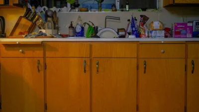
Large, open-plan, or sterile-feeling kitchens (think all-white and stainless) often need warmth to feel inviting and grounded. Warm colors on an accent wall or island can define a large area and add coziness.
3. Fixed Finishes & Fixtures
Your cabinets, countertops, and hardware have their own undertones that you must acknowledge. A successful kitchen refresh harmonizes with them.
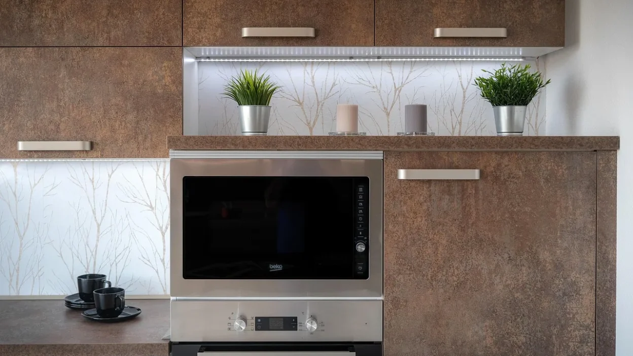
Warm existing elements: Honey-oak cabinets, brass or gold hardware, terracotta tile, wood floors with orange/red tones. These naturally pull you toward a warm palette.
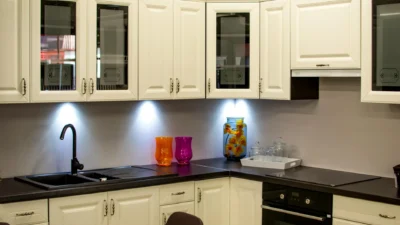
Cool existing elements: White marble or quartz counters, stainless steel appliances, chrome or nickel fixtures, gray-toned wood floors. These create a foundation that leans cool.

Scenario Guide: Which Palette Fits Your Kitchen Vibe?
Let’s apply the decision points. These common scenarios show how choosing kitchen undertones works in practice.
The Dark, North-Facing Kitchen
Lean WARM. Your goal is to add light and warmth. Avoid dark or cool colors that will feel cave-like. Choose light-reflective, warm neutrals like Swiss Coffee by Benjamin Moore or Accessible Beige by Sherwin-Williams. A warm, creamy white on cabinets can make the space glow.
The Small, Galley, or Windowless Kitchen
Lean COOL. Prioritize a sense of airiness and space. Crisp, cool whites (like Chantilly Lace) or very pale blues/greens (like Benjamin Moore’s Pale Smoke) can make walls recede. Keep the palette light and consistent to enhance the feeling of flow.
The Open-Plan, Sun-Drenched Kitchen
You have flexibility. The abundant light lets you play. To maintain a bright, serene feel, lean into cool tones. To enhance the natural warmth and create a cozy eat-in area, embrace warm tones. This is where your desired mood is the ultimate decider.
The Kitchen with Warm Wood Cabinets
Lean WARM or NEUTRAL. Cool wall colors can clash with orangey wood tones, making the cabinets look dated. Choose a wall color that complements the warmth, like a warm gray (greige) or a soft, earthy green with yellow undertones. This creates a cohesive, intentional look.
Mixing & Avoiding Pitfalls: Getting the Balance Right
Most great kitchens aren’t 100% warm or 100% cool. They use one temperature as the dominant theme and employ the other for contrast and interest. Here’s how to mix successfully and avoid common mistakes.
How to Mix Temperatures Successfully
The 80/20 rule is your friend. Choose one color temperature to dominate your large surfaces (walls, cabinets). Then, use the opposite temperature in smaller, strategic doses for accents. For example, in a cool, blue-and-white kitchen, introduce warmth through natural wood cutting boards, a rattan light fixture, or leather barstool seats. In a warm, cream-colored kitchen, add crispness with cool-toned marble countertops or stainless steel hardware.
Common Mistakes to Avoid
- Ignoring Undertones in Neutrals: This is the #1 pitfall. That beige can look pink, that gray can look purple. Always test large samples on multiple walls and view them at different times of day.
- Forgetting Fixed Elements: Don’t pick a wall color while only looking at a tiny cabinet door sample. Consider the whole room—flooring, counters, backsplash—as a single ecosystem.
- Choosing in Isolation: Your kitchen doesn’t exist alone. Consider the sightlines to adjacent rooms. A jarring color shift from a warm living room to a cool kitchen can feel disjointed.
Finding Your Kitchen’s Perfect Palette
The debate between warm vs cool kitchen colors doesn’t have a universal winner. The best choice is the one that strategically addresses your kitchen’s light, layout, and fixed elements to create the atmosphere you crave. A warm palette offers cozy, energizing comfort, while a cool scheme delivers calm, spacious serenity.
This isn’t about following a trend—it’s about making an intentional design decision that supports how you live in the space every day. Your final, non-negotiable step? Get samples. Paint large swatches directly on your walls and live with them for a few days. Observe how the color changes from morning to night, under both natural and artificial light. Your eyes, in your space, are the ultimate guide to a successful kitchen color refresh.