You cleared the countertops, you grouped the mugs, you even bought that cute ceramic canister. So why do your kitchen shelves still look cluttered? If your open shelving feels perpetually messy no matter how much you tidy, you’re not alone—and the problem likely isn’t your stuff, but how you’re seeing it. The frustration of a chaotic display, despite your best efforts, usually stems from a few overlooked visual principles, not a lack of storage. This article cuts through the guesswork. We’ll diagnose the specific reasons why kitchen shelves look cluttered (hint: it’s often about visual noise and rhythm) and then give you a straightforward, 15-minute editing protocol to transform them from a source of stress into a point of pride. Forget buying more organizers; the easiest fix is learning how to edit what’s already there.
Kitchen shelves look cluttered primarily because of visual noise from too many small items, inconsistent heights, and a lack of breathing room. The easiest fix is to treat your shelves like a gallery display: edit ruthlessly, group by color or function, and create intentional negative space. It’s less about adding more things and more about applying a few key display editing principles to what you already own.
The 3 Visual Principles Your Shelves Are Breaking
Your shelves feel messy not because you’re a bad organizer, but because you’re likely breaking a few fundamental rules of visual design. Think of your open shelves as a gallery wall. When a gallery looks chaotic, it’s not the art’s fault—it’s the arrangement. The same is true for your kitchen. Let’s diagnose the core issues.
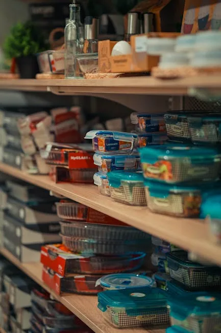
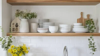
Photo by Théo Cold on Pexels
1. Visual Weight Is Unbalanced
Every item has a visual “weight.” A large, solid-colored mixing bowl feels “heavy.” A cluster of five small spice jars feels “light” but “busy.” The problem occurs when you have too many small, busy items scattered about. They create visual noise, making the whole shelf feel chaotic and dense, even if it’s not physically full. This is a primary reason kitchen shelf clutter happens.
2. Negative Space Is Missing
Negative space is the empty area around and between objects. It’s the breathing room that lets your eyes rest and appreciate what’s on display. When every inch of shelf is packed, there’s no negative space. The result is visual fatigue—your brain can’t process where to look first, so it registers the whole scene as a single, stressful block of stuff.
3. There’s No Visual Rhythm
Rhythm in design is about creating a pleasing, predictable pattern. On a shelf, this is achieved through consistent spacing and intentional variations in height. When items are all the same height, it’s monotonous. When heights are random with no logic, it’s jarring. A good rhythm guides the eye smoothly from one item to the next, creating calm and order.
Common Shelf Styling Mistakes (And How to Spot Them)
Now that you know the principles, let’s translate them into specific, fixable errors. These are the most common shelf styling mistakes that sabotage a clean look.
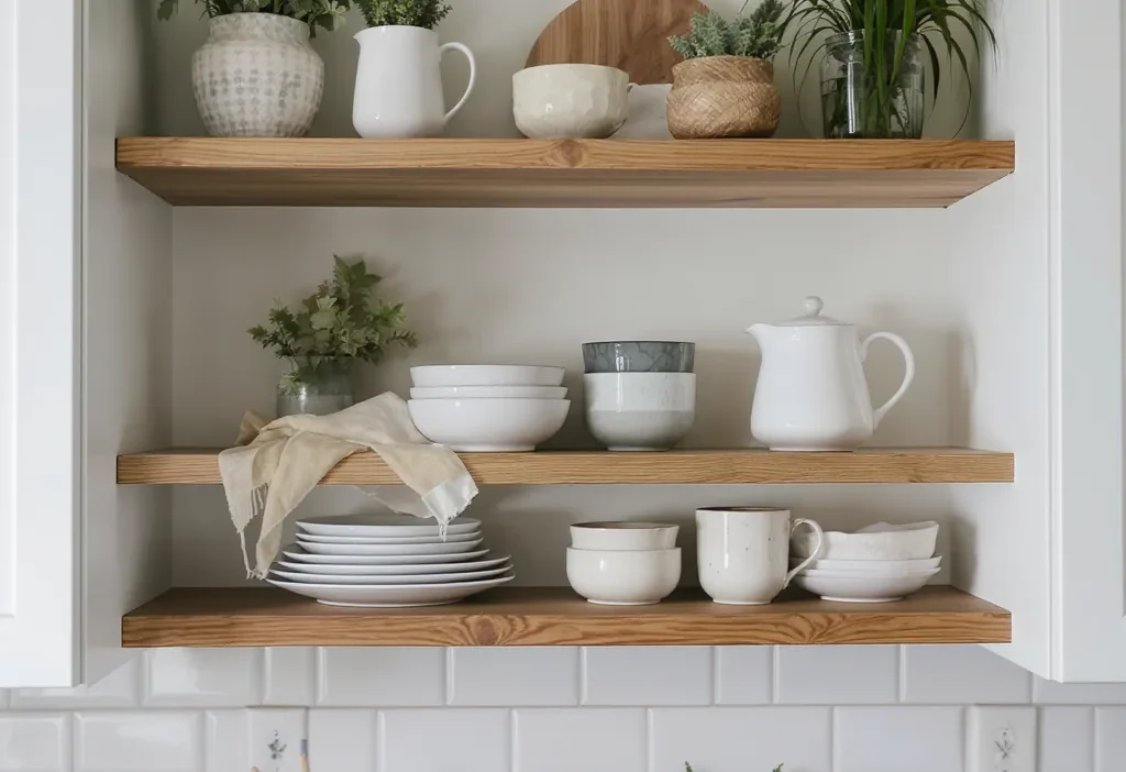
Mistake: The Everything-Is-Short Zone
The Fix: Introduce height. Place a tall vase, a stack of cookbooks, or a vertical utensil crock on one side of the shelf. This immediately creates a focal point and breaks the flatline, establishing a better visual rhythm.
Mistake: The Color Explosion
The Fix: Create a color story. You don’t need everything to be beige. Instead, group items by color family. Place all your white ceramics together, your wood tones in another cluster, and your glassware in a third. This intentional grouping reduces visual noise and looks curated. It’s a key tactic when you declutter open kitchen shelves.
Mistake: Functional Chaos
The Fix: Corral and contain. Daily-use items like mugs, oils, and spices are necessary but often visually messy. Use a small tray, a sleek basket, or a low-profile stand to group them. This creates a single, neat “zone” on the shelf instead of scattered pieces.
Here’s a quick checklist of red flags to look for on your shelves right now:
- No single item rises above the others.
- More than five different colors or material types are visible at once.
- Small items are sprinkled randomly, not grouped.
- You have to move one thing to grab another.
The Display Editing Protocol: Your 15-Minute Fix
Ready for action? This isn’t a full-day reorganization. It’s a focused editing session. Imagine you have 15 minutes before guests arrive. Here’s your step-by-step display editing protocol.
Step 1: Empty & Clean
Take everything off one shelf (just one to start). Wipe it down. You’re starting with a blank canvas, which is crucial for objective editing.
Step 2: Sort & Purge
Quickly sort items into three piles: 1) Love/Frequently Use, 2) Maybe, 3) Store Elsewhere or Donate. Be ruthless. That chipped mug or single-use gadget? It goes in pile 3.
Step 3: Group by Color or Function
From your “Love” pile, create small groupings. All white plates together. Wooden cutting boards stacked. Coffee mugs clustered. This is the stage where you actively fight visual noise.
Step 4: Play with Height & Depth
Start placing groups back on the shelf. Put a tall item (like a vase) on one end. Stack plates or bowls to create height. Place a smaller item in front of a taller one to add depth. Leave deliberate gaps between groups—that’s your negative space.
Step 5: Step Back & Edit
Walk away for 30 seconds, then look at your shelf. Does your eye bounce around or flow smoothly? Is there a “heavy” side? Remove one more item. This final edit is often the difference between “styled” and “stuffed.”
Pro Moves for a Curated, Not Cluttered, Look
Once you’ve mastered the basic edit, these subtle tweaks will elevate your shelves from organized to intentionally designed.
First, designate one “hero” piece per shelf. This is an item you truly love—a beautiful pitcher, an artful bowl, a vibrant cookbook. Give it pride of place with plenty of breathing room. Everything else on that shelf plays a supporting role.
Second, repeat a material three times. Cohesion comes from repetition. If you have a wood cutting board, add a wood salt cellar and a wood utensil. This creates a subtle thread that ties the display together. The same works for metal, white ceramic, or glass.
Finally, remember that open shelving is a dynamic display, not a museum. It’s okay for it to change with the seasons or your needs. The goal is to understand the principles so you can easily fix the shelf arrangement mistakes when they creep back in. For more on creating a cohesive kitchen palette, resources on basic color theory in design can be helpful.
Your Shelf, Edited and Elevated
Clutter on open shelves is a visual puzzle, not a personal failing. By understanding the principles of weight, space, and rhythm, you can diagnose the problem in seconds. The fixes are about thoughtful subtraction and intentional placement—editing what you have, not buying more.
The most powerful step is the first one. Don’t try to overhaul your entire kitchen. Instead, pick a single shelf that bothers you the most. Set a 15-minute timer and run through the editing protocol. That immediate, visible win will give you the confidence and clarity to tackle the rest. Perfect isn’t the goal; a shelf that feels calm and collected is.