That perfect gray you so carefully picked in the store isn’t betraying you—your kitchen’s light is. It’s a universal DIY frustration: a paint color looks serene and sophisticated on the little swatch, but once it’s on the wall, it suddenly looks too blue, too green, or just plain wrong. This isn’t a sign of poor taste or a faulty can of paint; it’s the predictable result of physics and your unique kitchen environment. Understanding why kitchen paint color looks different is the first step to taking control of the process. This guide will break down the simple science behind the shift and give you a foolproof, stress-free protocol for testing colors so you can finally choose with confidence.
Kitchen paint color shifts because of three main factors: the color temperature of your light bulbs (warm yellow vs. cool blue), the changing intensity and angle of natural daylight throughout the day, and how surrounding surfaces like cabinets and countertops reflect color back onto the walls. The easiest fix is to bypass tiny chips and systematically test large paint samples directly on multiple walls, observing them under both natural and artificial light at different times over 48 hours.
The 3 Culprits: Why Your Kitchen Light Plays Tricks
Your paint color isn’t changing—the light hitting it is. This kitchen paint lighting effect is a fundamental principle of color science, not a flaw in your choice. Once you understand the three main factors at play, you can predict and control them.
1. The Color Temperature of Your Light Bulbs
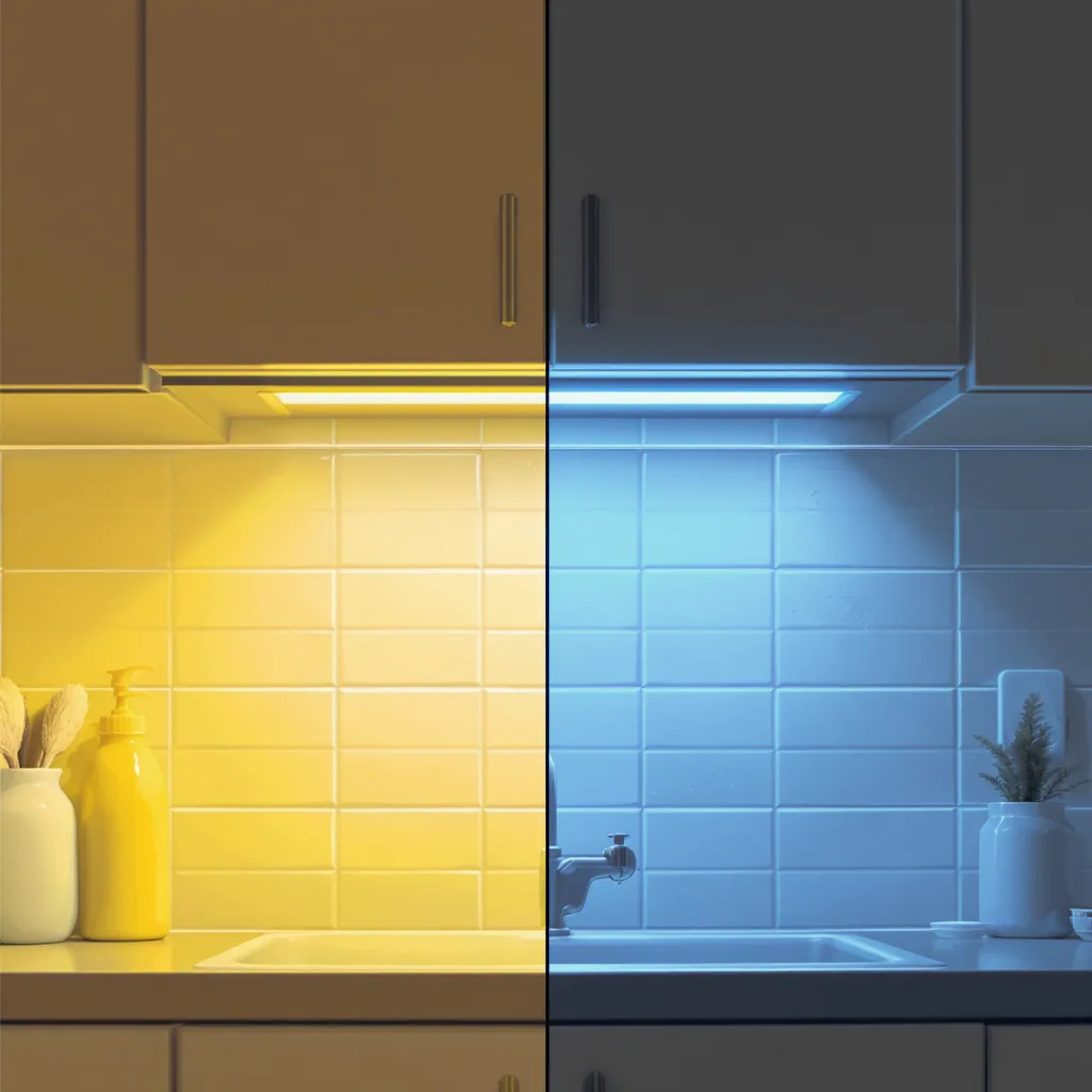
All light has a color, measured in Kelvins (K). Standard incandescent or “soft white” bulbs (2700K-3000K) cast a warm, yellow glow that can make cool colors like blues and grays appear muted, muddy, or even slightly green. Conversely, bright “daylight” bulbs (5000K-6500K) emit a cool, blue-white light that can make warm colors like creams and beiges look stark, sterile, or washed out. The color temperature and paint relationship is the most common reason a color looks perfect in the store (under specific lighting) and wrong at home.
2. The Quality & Angle of Natural Daylight
Sunlight isn’t constant. Morning light is cool and blue, midday light is bright and neutral, and evening light is warm and golden. This daily shift alone can make your wall color look different at breakfast versus dinner. Furthermore, the direction your windows face has a huge impact. North-facing light is cool and indirect, often making colors appear flatter and bluer. South-facing light is warm and intense, amplifying yellows and reds in paint.
3. Color Reflection from Fixed Elements (The Bounce Effect)
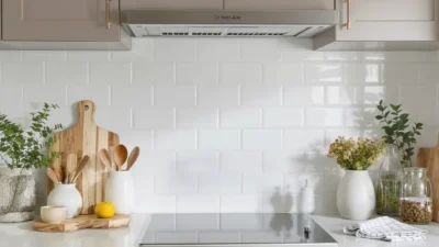
Light doesn’t just travel from the bulb to the wall. It bounces. The permanent surfaces in your kitchen—your cabinets, countertops, flooring, and backsplash—act as giant color reflectors. A wall next to rich, cherry cabinets will soak up warm red tones. A wall opposite a vibrant blue tile backsplash will pick up a cool cast. This light reflectance value of surrounding materials is a silent partner in your final color result.
Your Foolproof Paint Testing Protocol
Now that you know why it happens, here’s how to beat it. The goal isn’t to find a color that looks the same in every light (impossible), but to find one you love in your kitchen’s specific light. This methodical approach to how to test kitchen paint colors eliminates guesswork.

Photo by Maria Mileta on Pexels
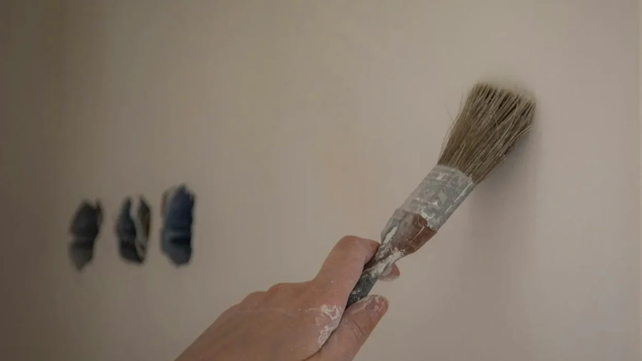
DO: Test Large Swatches Directly on the Wall
Paint at least two 2′ x 2′ samples directly onto the wall in different locations. Test a section that gets direct sun and one that’s in permanent shadow. Painting directly on the wall (not on poster board) is crucial because it shows you the true interaction with your wall’s texture and the existing color underneath.
DO: Observe for a Full 48-Hour Cycle
Live with the samples. Look at them in the morning, at midday, in the evening, and most importantly, at night with all your artificial lights on. This reveals the full range of the paint color changes in light. Note how it looks under under-cabinet task lighting versus overhead ambient light.
DON’T: Judge by the Tiny Chip or at One Time
The tiny paint chip from the store shows you a color, but not how it behaves. It’s a starting point, not a final verdict. Never buy gallons based on a chip viewed only under the hardware store’s fluorescent lights. Similarly, making a snap decision at 2 PM guarantees disappointment at 8 PM.
DON’T: Ignore Your Fixed Elements
Hold your large sample swatches next to your cabinets and countertops. Does the paint make your granite look dated or your oak cabinets look orange? The right color should harmonize with these permanent fixtures, not fight them.
Scenario: Solving for North-Facing vs. South-Facing Windows
Let’s apply this knowledge to two classic kitchen dilemmas. Your window direction dictates your starting strategy.
The North-Facing Kitchen: This space receives cool, bluish light all day, which can lack warmth. The risk here is choosing a paint with cool undertones (like a gray with blue or green bases), which can make the room feel icy and uninviting. Fix: Counteract the cool light by choosing a paint with warm undertones. Opt for a warm gray (with a taupe or violet base), a creamy off-white, or a soft, warm pastel. These colors will balance the light and add coziness. For more on light science, resources like the National Institute of Standards and Technology explain color measurement principles.
The South-Facing Kitchen: Blessed with abundant, warm yellow light, this room can feel overly bright and hot. The danger is choosing a paint with strong yellow or red undertones, which can become overwhelming and garish in the intense sun. Fix: Use the light to your advantage. You can successfully use cooler colors that might feel too stark in other rooms. Crisp whites, clean grays, and even soft blues or greens will be warmed and softened by the ample sunlight, resulting in a bright, airy, and balanced feel.
Common Mistakes That Guarantee Color Regret
Even with the best intentions, a few missteps can derail your project. Steer clear of these pitfalls to ensure your chosen color works in reality, not just in your imagination.
- Choosing from a tiny chip under store lighting only. This is the number one cause of disappointment. Store lighting is designed for visibility, not accurate color rendering.
- Testing a color on only one wall. A color that looks great on a sun-drenched wall might look dead and dull in a corner. You need to see its full range.
- Ignoring the fixed elements. Falling in love with a trendy sage green without considering how it interacts with your honey oak cabinets is a recipe for clash.
- Rushing the decision. Patience is key. You need to see the daylight vs artificial light paint performance. Give yourself at least two full days to observe the samples in all conditions.
Master Your Kitchen’s Light, Don’t Fight It
The frustration of a paint color looking “wrong” is a universal experience, but it’s not a sign you have bad taste. It’s a sign you’re noticing the powerful, dynamic role of light. By understanding the three culprits—light bulb color, daylight quality, and reflected color—you shift from being a victim of circumstance to an informed designer.
Armed with your foolproof testing protocol, you can now explore colors with confidence. View the process not as a hurdle, but as the final, essential step in choosing a color you’ll truly love morning, noon, and night. So grab some sample pots, paint those large swatches, and observe. Your perfect kitchen color is waiting to reveal itself.